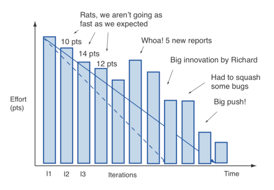
It is mainly used to measure how much work is left to be done is shown by burn down chart.

The burndown is a chart that shows how quickly you and your team are burning through your customer's user stories. It shows the total effort against the amount of work we deliver each iteration. Something like this:

We can see the total effort on the left, our team velocity on the right. But look what else this simple graphs gives us.
- Work done each iteration
- Work remaining
- Work done so far
- When we can expect to be done
All this from one graph!
Now what you see above is pretty ideal. A more realistic burndown looks something more like this:
